

 Appreciating a Masterpiece: 3-Iron
Sometimes, one sheet is all it takes to pique your interest in a film. A dazzling color scheme, a clever concept, an arresting image. Film posters are more than just marketing materials – they’re undeniably an art form in themselves, with the world’s greatest illustrators and designers creating works that have sometimes become as iconic as the movies they’re promoting. Because good posters are often underappreciated, we don't tend to notice the good ones. It's usually the bad ones that catch our eyes.
Please know that I don't have any credentials in graphic design. So take my opinions with a grain of salt. That being said, let's get into some of the posters I personally find fascinating. There might be minor spoilers while discussing the posters, so proceed at your own discretion.
The graphic design characteristics of Movie posters generally have an analogous format since they usually contain similar contents, such as a title, the characters, and a tagline. Considering that, the graphic attributes also can be summarized based on the contents. Generally speaking, a movie poster element can consist of 4 major elements.
- Characters:
The characters who drive the story are a core element of any movie. Also, characters are a major element to bear in mind when designing a movie poster. The number of actors, their body posture, the portion of actors on the poster, and so forth can be adjusted to effectively deliver the movie’s context.
- Background image:
The background image of a movie poster can illustrate more detailed information about the movie. The image can imply the historical background, where the story takes place and the main plot in the story.
- Color:
A movie poster’s color concept illustrates the movie’s mood. In general, color is utilized as a symbolic attribute to deliver the message of contents and inspire sentiments. Also, the meaning that the colors imply can be similar or dissimilar across cultures. The color of a poster implies the tone and story that the movie tells across a country or region.
- Text
The text attributes, such as the title and taglines, help audiences understand the story and characteristics of a movie more directly. The text is not very emphasized in Western movie posters, aside from the title, but it is considered to be an important element in Asia when promoting a movie.
But the combination of these varies a lot based on which country the poster is intended for. So over the course of few articles, let's go country by country (China, Japan, South Korea) and see what the general trend is and check out a few posters that I personally find fascinating.
China
If you look up Chinese posters, you will find a lot of cases of plagiarism. But the ones which are good and original are some next-level stuff. let's take a look at the posters for The Wandering Earth (2019). The main poster is atrocious with all the characters piled up together like a Marvel movie mashup with bad photoshop. But the scenic ones are pretty good. After all, the draw of the films is not the actors but the world of the story.
The Ugly | The Good |
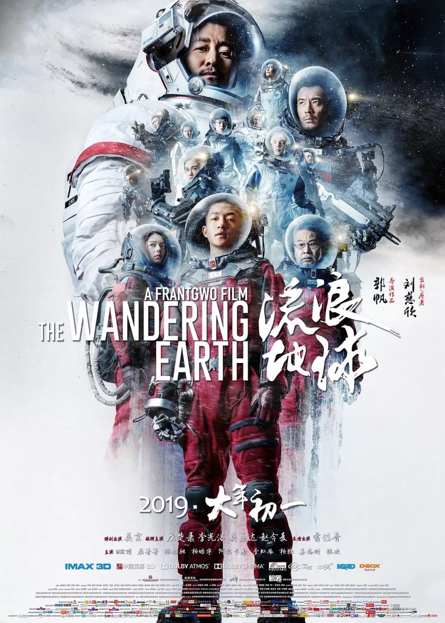 | 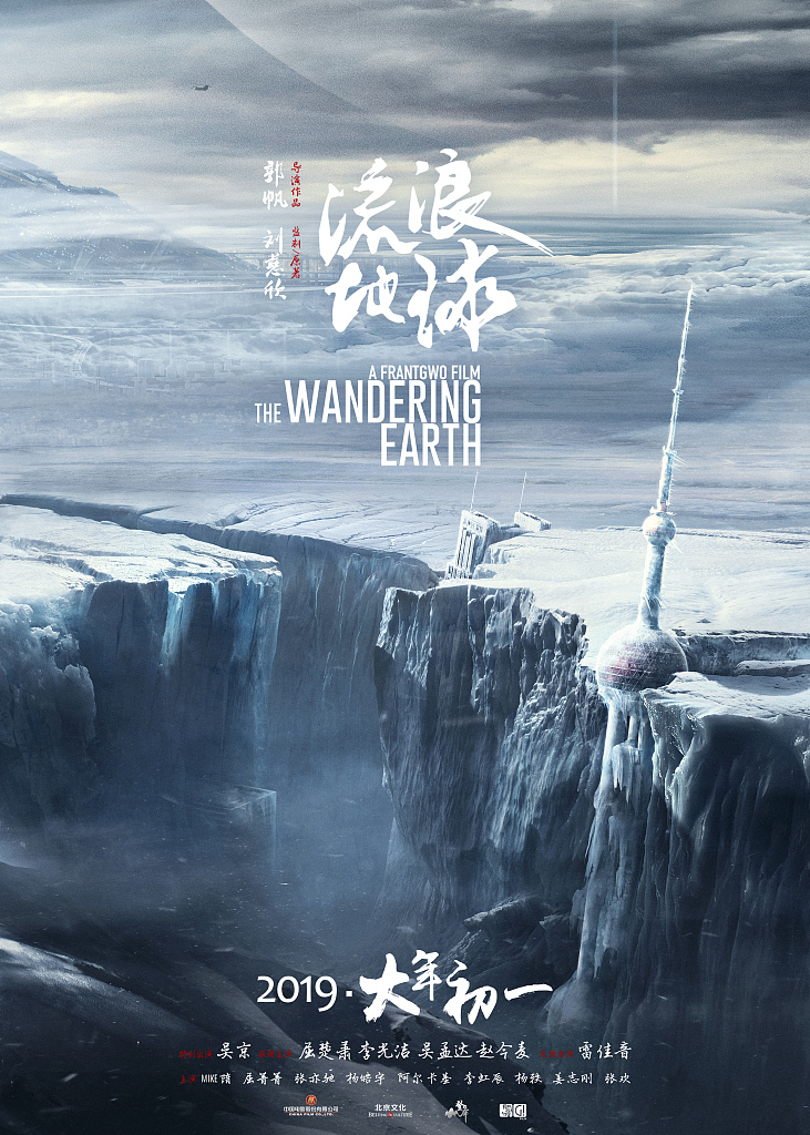 |
But here is my favorite one.
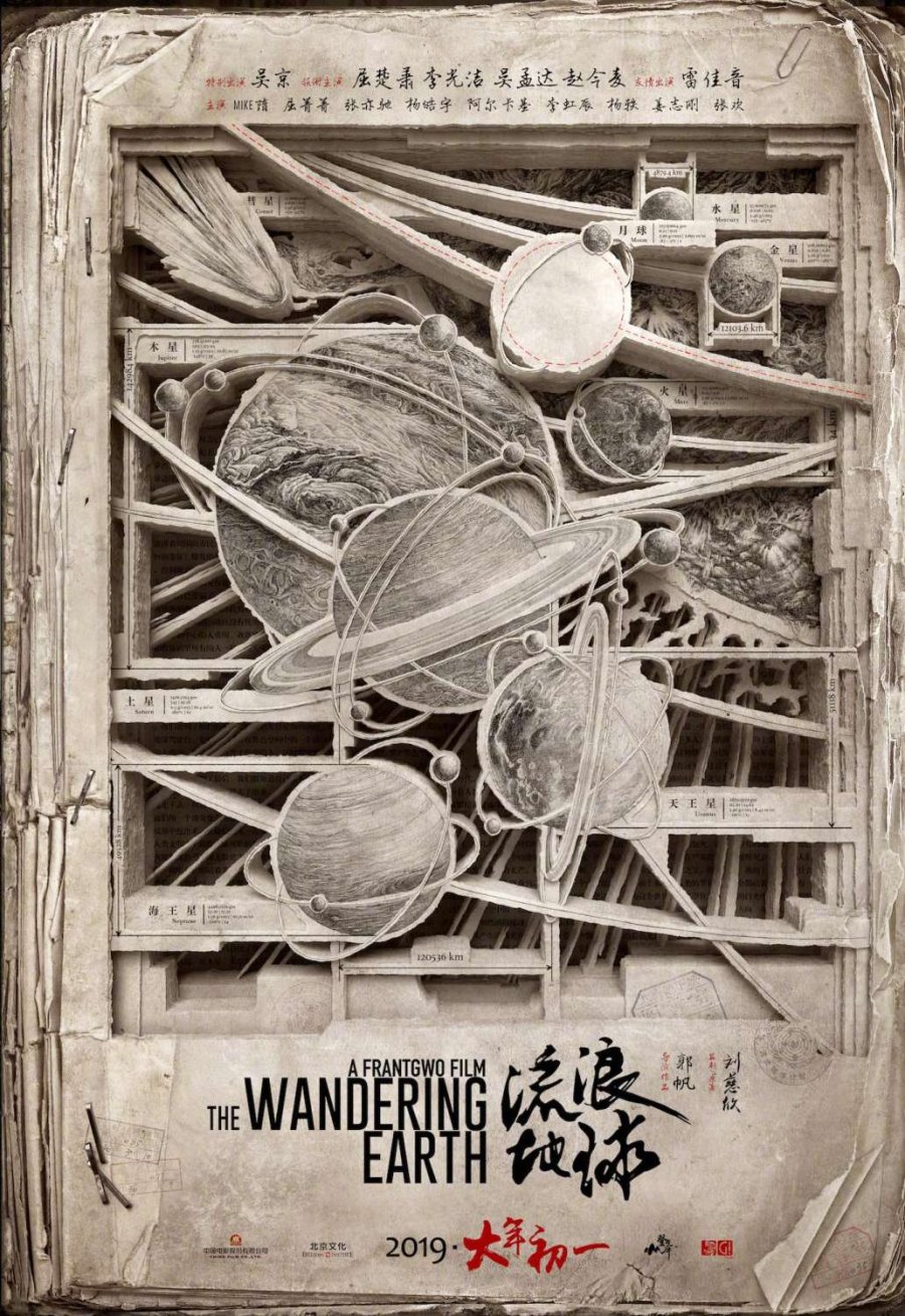
Unlike the others, it captures the main point of the movie. The movie is an adaptation of a Chinese Science Fiction Classic. The homage to the original story is conveyed by the picture being carved from a book. The old and torn-out pages, held together by the stapled pins capture the post-apocalyptic theme of the movie where the human society is barely functional. It oh so cleverly illustrates the story of the movie. See how in the poster every planet of our solar system is present except the Earth. Intriguingly missing, leaving an empty spot. Perfectly depicting the story of The Earth leaving the Solar System behind. That's some next-level shit.
But if you talk about pure visual poetry, Chinese posters are probably one of the bests in the world. Check out the below posters. I can spend hours just looking at them. They are visually so strikingly poetic and beautiful.
 |  |
 |  |
Here is another from the movie The Golden Era (2014).
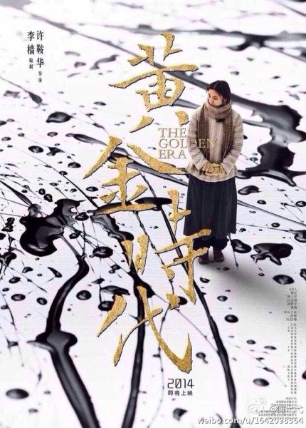 | The Golden Era (2014)The movie tells the story of Xiao Hong, a woman activist, and novelist, in wartime China. The tilt-shift effect and high angle shot look down onto her as if she is a miniature model. The much larger white negative space represents the big world she is living in. The splashes of ink are the representation of the chaotic time the film is set in and also signifies how much influence she, as a writer, has on the world. The movie's name in a golden font in this largely colorless poster is a cherry on the top. |
Now let's take a look at one of the Documentary posters.
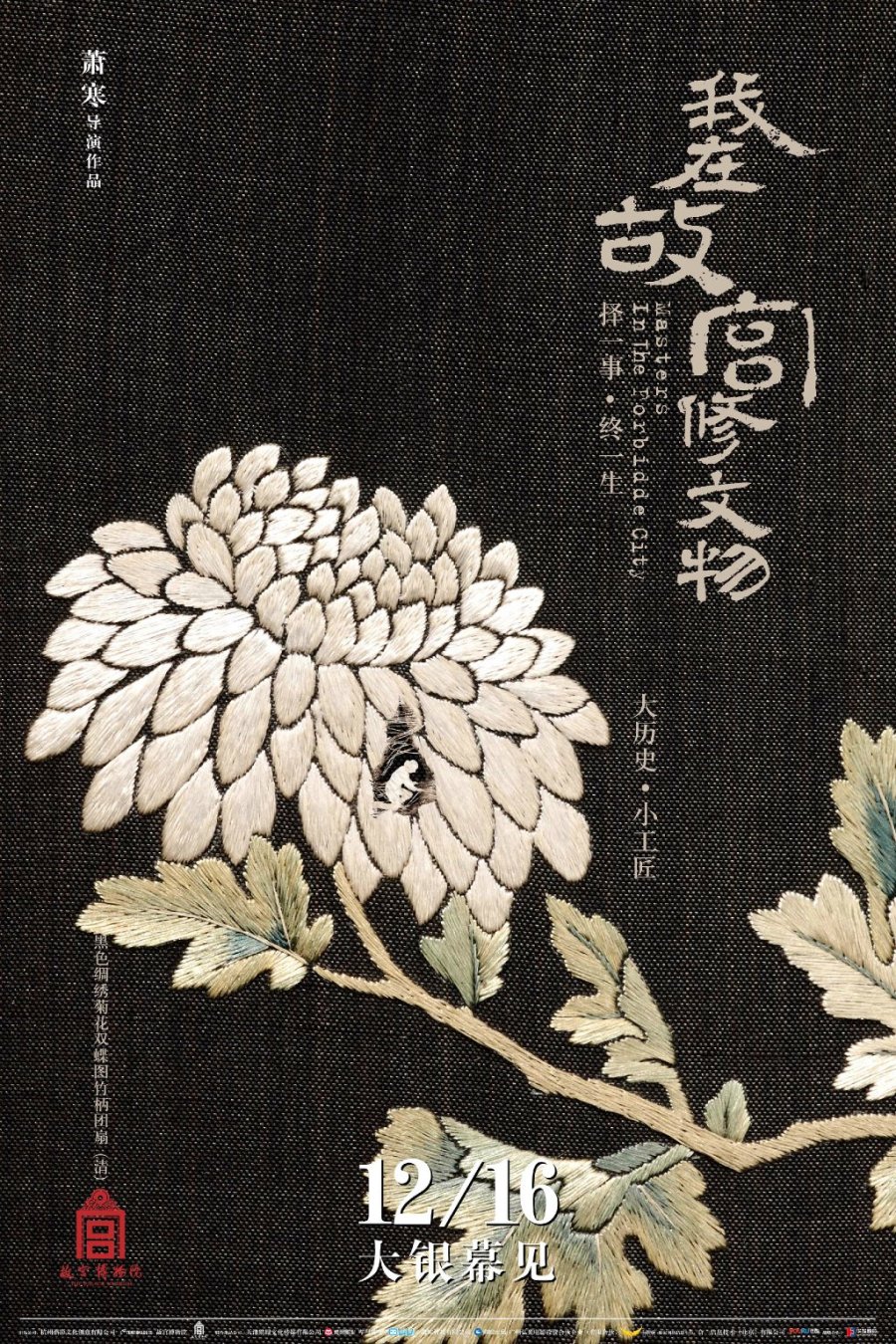
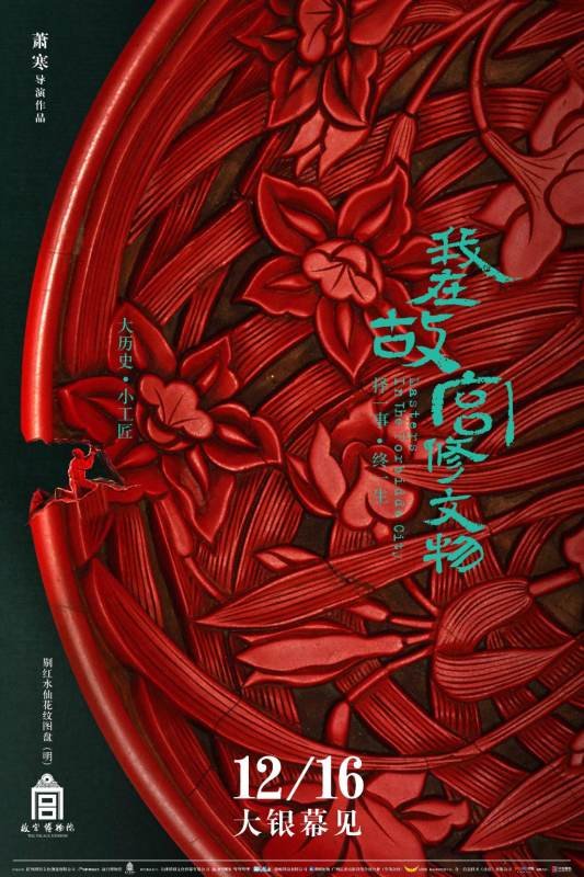
Masters in Forbidden City (2016) | |
This documentary shines a light on the unsung life stories of restorers of cultural relics working inside the Forbidden City. The entire poster is almost taken over by the colorful ancient artifact which is by itself is more than enough to draw your attention by its sheer beauty. But what makes it special is the tiny, almost unnoticeable detail at the top of the relic, just below the first line of text. Maybe this is what they mean when they talk about giving life to an art piece. The size of the worker is tiny, insignificant while the relict is immense. It captures the history, a moment in time, and also the atmosphere of museums perfectly. Enticed by the beauty and heritage of the relics, we the audience almost always overlook the hard work and dedication of the amazingly talented people working behind the scenes. | 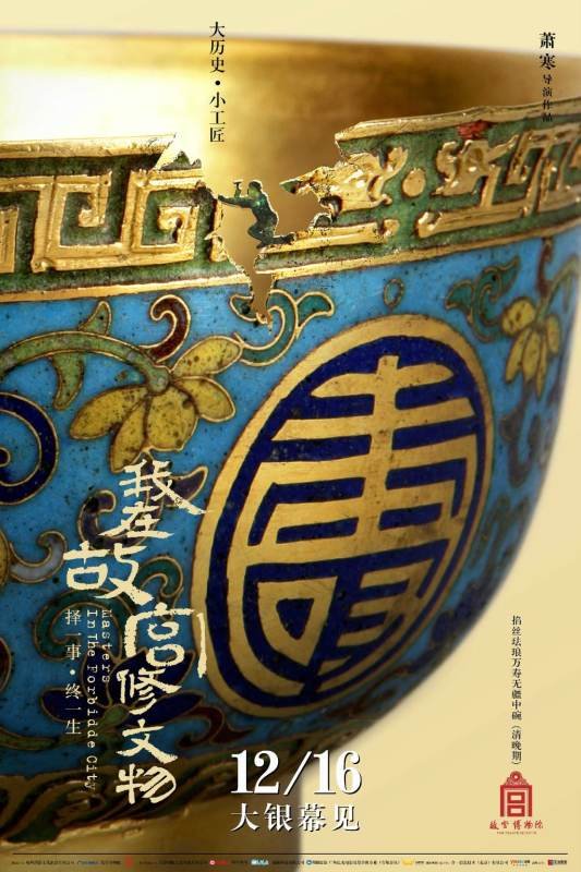 |
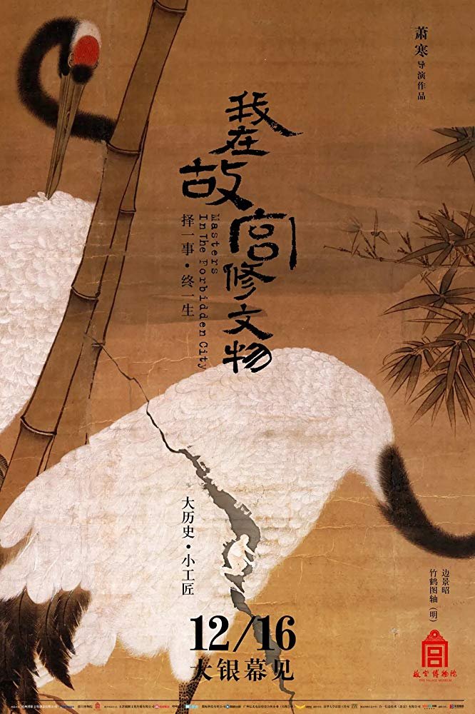
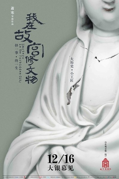
| Here are a few more from the same documentary for your viewing pleasure. See if you can find the museum workers in each of these. They are there for you to pay a little attention and see, just like in real life. | |
 |  |
 |  |
And here is the last one for today. From the movie Brotherhood of Blades 2 (2017).
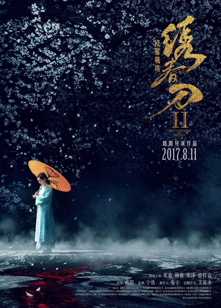 | Brotherhood of Blades 2 (2017)This poster is visually beautiful. But what's interesting is how small in the frame the character is. We all know how high-profile an actress Yang Mi is and someone who is absolute to draw in more box office. The decision to have her so small in the poster is bold, to say the least. But it elevates the poster on another level. The beautiful composition catches your eyes and the empty negative space leaves you wanting more. |
If all these posters are any indication, then this art form of a poster from China is going to get even better. And I for one, looking forward to it.
I am sure you have posters that you liked but are not listed here due to time and space limitations. Please let me know in the comments, maybe with a link to the poster's image? Thank you for your time and for letting me indulge a little.
Adios.
Source & References:
- researchgate.net
- Accented Cinema (YouTube)
Editors: BrightestStar (1st editor)


