this was my profile when i began messing with it earlier, first stop: cohesive background y/n
So I did some more changes and I don't know what I think, what do you guys think?
i'm still messing with it, so there is an image just in case (originally here was a pic of the light version) ... i did in fact mess with it, and I got a dark version (i maybe like that one a little more) so i need help choosing
i kinda feel like the dark version would need a different gif (and maybe a tighter gradient for the extra colours) and of course a new profile pic. or should i not be doing the gradient thing? ?
landed on alternative of the dark version, please lemme know what you think! (also yes i did change my profile pic at this stage)
so i keep messing with it and i changed the layout a little and wanted to see it side by side with the old ones. i'm really happy that i tightened the gradient,,,, but are the two extra gifs next to the challenges making it look a little cluttered? maybe? ...... actually, no they need to be there, it's too empty otherwise. okay i think i'm satisfied now
(5 hours later) I changed the gifs and challenge badges around but basically i think i'm done, check the finished product on my profile: https://mydramalist.com/profile/katherine197
last edit:
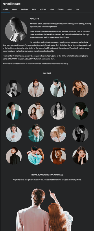
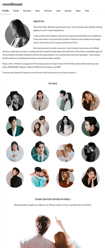
| first pass at the new layout | final |
 |  |
i thought it would be nice to have the final appearance here as well, for comparison and documentation's sake (for when i inevitably start messing with it again)






 mizore s:
