15. Popularity

Under construction 

Reservations ;  Top Ten Webdramas of Week ; Heat index on Youku ;  Douban ; etc

RESERVATIONS

Despite little hype before airing, reservations ran in the millions :

1 million  on Nov.26
1.5 million on Nov 26
2 million on Nov.28
2.66 million on Nov.29
3 million on Nov.30


HEAT INDEX ON YOUKU PLATFORM 

as kept track on by Dreams on her Youku Heat Index Ranking page:

Highest peak: 9 000+

  • 12/06 -> 9 000
  • 12/03 -> 8 500
  • 12/02 -> 8 000
  • 12/01 -> 7 500
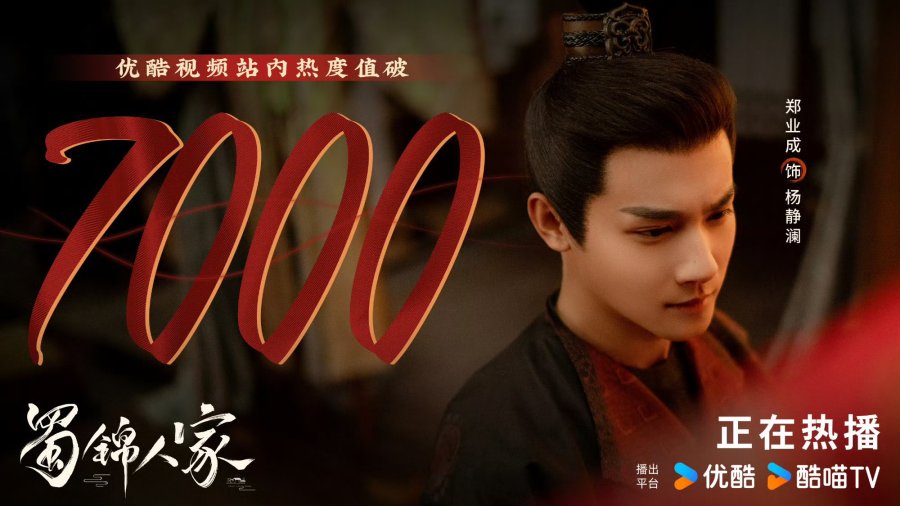
  • 12/01 -> 7 000
  • 12/01 -> 6 500
  • 11/30 -> 6 000


NoteEach "platform" (Youku, WeTV, iQIYI) have their own "heat index" system while the show is still 'on air". On Youku the 10,000 benchmark was considered maximum, and as soon as dramas passed the 100, 300, 700 mark, the platform celebrated with posters boasting the achievement.  Since end July 2024, the 10,000 cap was lifted in order to keep track of outstanding dramas. 

STANDING AMONG TOP TEN WEB DRAMAS OF THE WEEK

as reported on the Marcus Here! YouTube drama news channel :

#2  (week ending Sundqy Nov 8, 2024)


NUMBER OF 

PEOPLE WATCHING

(Beijing time)

Note: if a show has 50m average views by the end of the show, it is considered as good to excellent, and 100million avg views dramas is considered as explosive ; in the past two years,  few dramas crossed 100 million views per episode in a day (mentioning THE KNOCKOUT and JOY OF LIFE2 as benchmarks before July 2024).


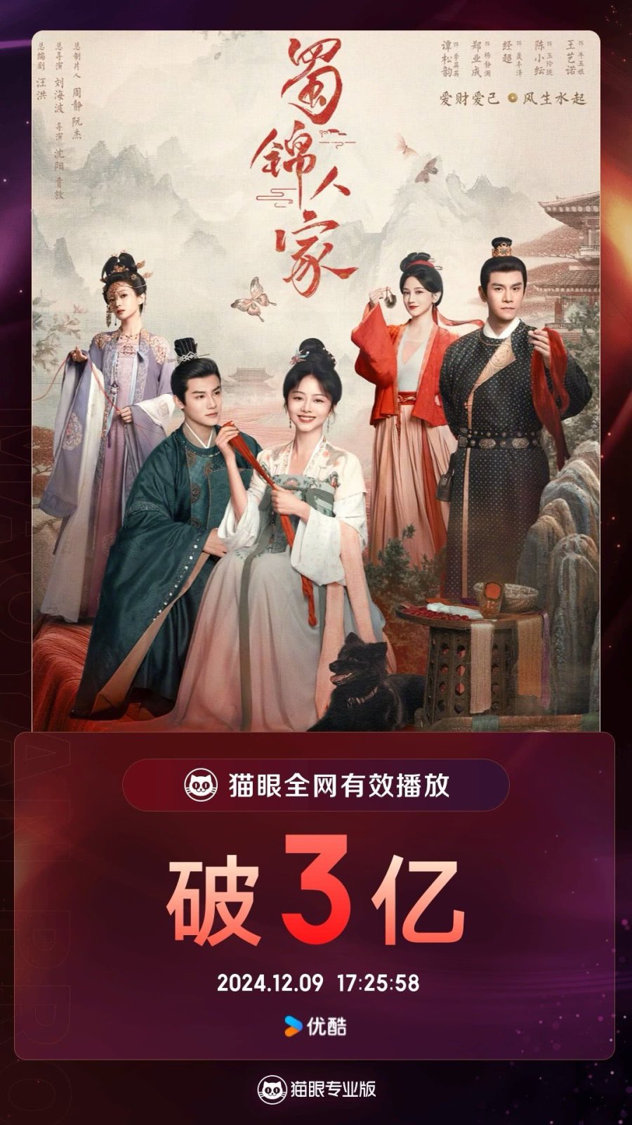
Dec9, 2024 : 300 million views (3 亿 /3 yì) at 5:25 pm


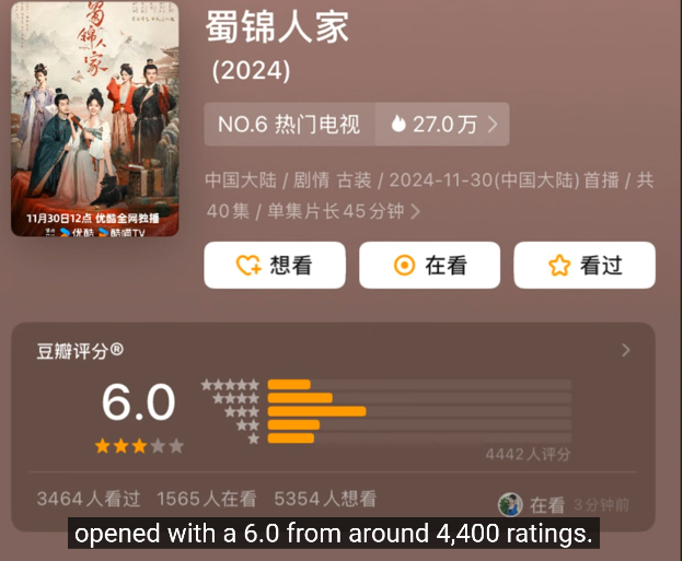
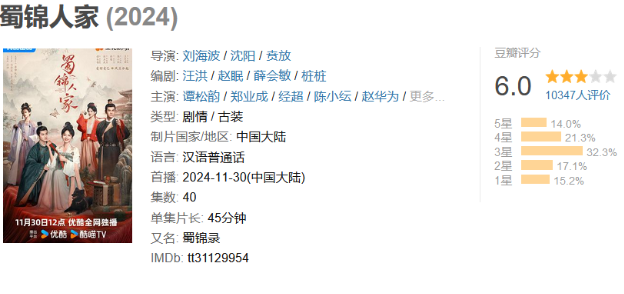
DOUBAN RATING


As noted by Marcus Sim, the Opening Douban rating came quite early, since 16 only out of 40 episodes had been released at time of publication, which made several drama news and watchers perplexed and of course, disappointed. Although this score could still go up, or down, depending on how the story unfolds.

Click on picture of the Douban page to the right, to check evolution since this screenshot of Dec.11, 2024


Link back to Table of Contents

16. Live Streams, vlog, interviews, articles, reviews 

Under construction 


Link back to Table of Contents

17. 

Under construction 


Link back to Table of Contents

Thank you for everything you do! It's great to have such an extensive companion piece (in the making)!

I have one question/tip though:
The white text on the light grey is VERY hard to read. I have my theme settings for my browser set to a dark background, because that is much easier on the eyes to read. Which means the text changes into white instead of black (I assume the text on the light grey is originally black). Can you perhaps change it to a different colour for people who have their theme settings set to a dark colour?


Thank you so much!

 Sheriziya:

Thank you for everything you do! It's great to have such an extensive companion piece (in the making)!

I have one question/tip though:
The white text on the light grey is VERY hard to read. I have my theme settings for my browser set to a dark background, because that is much easier on the eyes to read. Which means the text changes into white instead of black (I assume the text on the light grey is originally black). Can you perhaps change it to a different colour for people who have their theme settings set to a dark colour?


Thank you so much!

Thanks for liking the additional info; there is some I feel could need more digging into, both for background and culture and for quick notes about artists, and of course proofreading.   It's been a while since I was meditating about whether or not to tackle a mini profile about the sweet squirrel, whose drama works and singing I like a lot.  Now there's a green leaf to add to her grove of tall trees ?  But with end of year, time seems to get shorter, as daylight does.  So again, maybe next time, if I can't do it now.

Tell me if dark purple 553982 pre defined option is better then on the light grey backgrounds ? Or THIS  (dark purple #301934 on light grey pre defined)?  

I will perhaps experiment with dark background for text too, since you are among the readers who prefer it. I tried to use that before, but it did not feel more comfortable for my light dichromatic, slightly tritan eyes.

Well, it's never been easy to address ergonomically some combinations. At one time, yellow hues on (then favored) light green color backgrounds on industrial monitors could appear almost as invisible as writing messages with lemon juice on some white paper - a trick I learned in kid scouts group way back when).  Dark settings may make it easier to differentiate, but even there, ergonomics have not yet caught up with always changing to appropriate combinations, as you pointed out.   -- Let's see if dark purple, aubergine, is going to be easier with grey backgrounds?   (Switching on "Smoke on the water, fire in the sky" lol).

No hurry though, since this is far from complete, and I also would like some time to enjoy the dramas I am watching (old and new ones, yeah ikr: way too much, reflectively biting into a seasonal Nürnberger Elisen-Lebkuchen specially flown over to me care of DHL, and thinking the squirrel might approve, if she has a sweet tooth.).