 Old posters of June 2020, which will be replaced by alternates ones perhaps like this one: Old posters of June 2020, which will be replaced by alternates ones perhaps like this one:
  OChén Zhéyuǎn as SML Yǔ Xuān OChén Zhéyuǎn as SML Yǔ Xuān
 Péng Guānyīng 彭冠英 as ML Lǐ Shūbái Péng Guānyīng 彭冠英 as ML Lǐ Shūbái
 Yáng Zǐ 杨紫 as FL Huáng Zǐxiá Yáng Zǐ 杨紫 as FL Huáng Zǐxiá
 Xuān Yán 宣言 as Wáng Yùn Xuān Yán 宣言 as Wáng Yùn
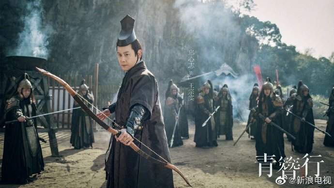 Qiū Xīnzhì 邱心志 as Wáng Zōngshí Qiū Xīnzhì 邱心志 as Wáng Zōngshí | [Qīng Zānxíng 青簪行] Filmed Nov. 2019 to July 2020 in Xiangshan Film and Television City, 60 episodes initially to be aired on Tencent Video. Due to major controversies, it was almost shelved, cut down to 40 episodes as of October 2023 and partially refilmed; airing perhaps in Q3 or Q4 2024.This was an S+ (expensive, 400 million rmb) drama that got stopped in its tracks because of the scandal that ended with jailing of actor and singer Kris Wu. It was reshot end of 2023, although not as early as the two weeks set aside for the Chén Zhéyuǎn part in September envisioned. Another controversy hit the costumes and accessories, deemed too close to Japanese, when foreign costumes are not allowed anymore in such costume "historical" dramas. The drama in the drama continued when Lín Gēngxīn 林更新 who initially had agreed to take on the part formerly done by Kris Wu, bowed out. He was finally replaced by Péng Guānyīng in Nov2023 (koalasplayground 2023.08.28, 2023.11.21 , 2024.01.13 for full story). The news were confirmed by several posts of January 2024 from Yang Zi (who had finished her reshot parts), Xuan Yan and LiuYihang.
(*) "Co-produced by Penguin Pictures, New Classics Media, and Phoenix United Pictures, the costume, detective, romance drama "#TheGoldenHairpin starring #YangZi and #PengGuanYing is expected to be aired on #CCTV-8 at the end of October and will be exclusively broadcast on #TencentVideo." (reported by Yu Haoling on MDL, Oct.11, 2024) "As reported on NetEase, sources are saying that the costume drama has passed all official approvals after multiple reshoots and other post-remedial work, and has already received its airing schedule." (Yahoo, Oct.16, 2024) Cast : Chén Zhéyuǎn as SML Yǔ Xuān 禹宣
Xuān Yán 宣言 (as Wáng Yùn 王蕴)
Yáng Zǐ 杨紫 (as Huáng Zǐxiá 黄梓瑕)
Péng Guānyīng 彭冠英 (as Lǐ Shūbái 李舒白 )
Qiū Xīnzhì 邱心志 (as Wáng Zōngshí 王宗实)
Calvin Yú Xiǎowěi 于小伟 (as Emperor Huángdì 皇帝)
Suí Jùnbō 隋俊波 (as Empress Wáng Huánghòu 王皇后)
Zhào Yīngbó 赵英博 (as 7th Prince Qī Wángyé 七王爷)
Lǐ Yìnán 李逸男 (as 9th Prince Jiǔ Wángyé 九王爷)
Ruǎn Jù 阮巨 (as Princess Qí Lè jùn zhǔ 歧乐郡主)
Liú Yǐháng 刘已航 (as Zhōu Zi Qín 周子秦)
Summary of story and rest of cast on Baidu :
The play is adapted from the novel " The Record of Hairpin " 《青簪行》 by CeCe Qinghan . It tells the story of a love-hate relationship between the daughter of an official, amateur sleuth Huang Zixia (only survivor of a family that had been brutally wiped out, and falsely accused of the murders), and Li Shubai. They gradually uncover shocking secret cases touching the Tang Dynasty royal family
The novel was translated into English by Alex Woodend and published by Amazon Crossing (20 Feb. 2018) in a 302p edition, and it is possible to switch between reading the Kindle book & listening to the 9hrs 46 min Audible audiobook with Whispersync for Voice. It is narrated by Emily Woo Zeller and was published on same date as the translation.
|